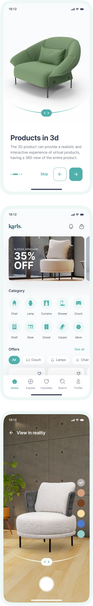
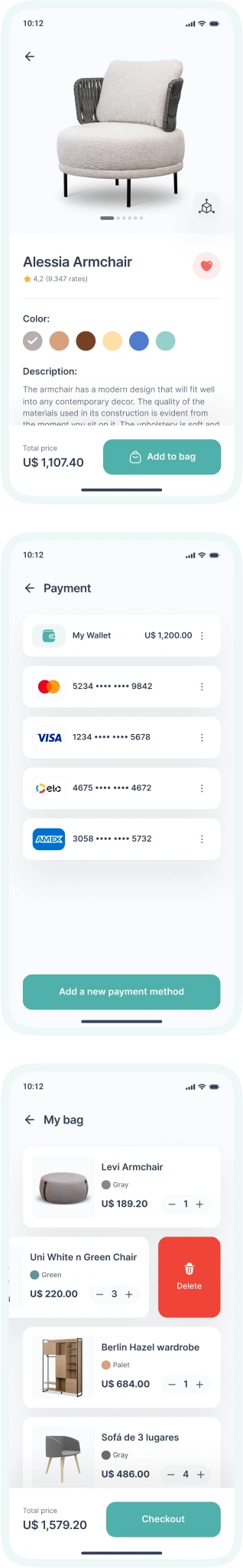
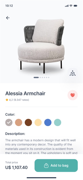
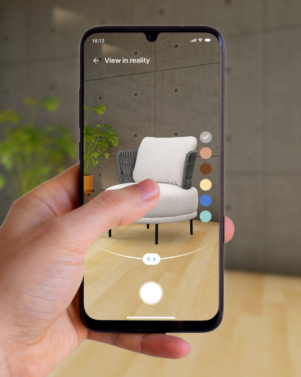
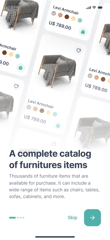
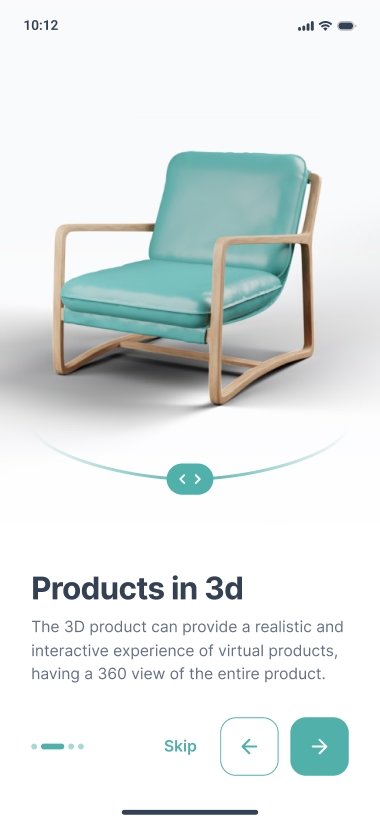
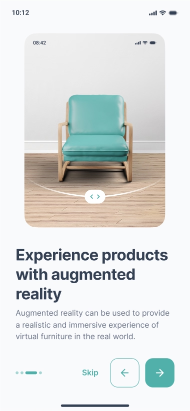
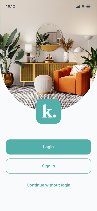
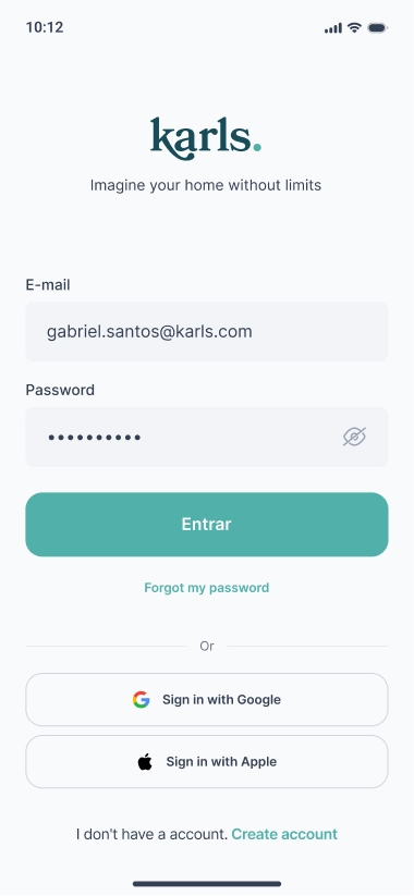
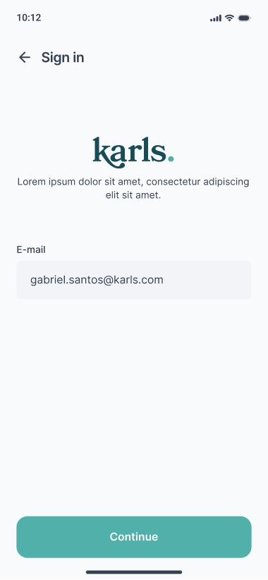
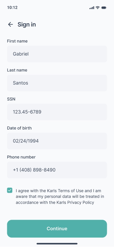
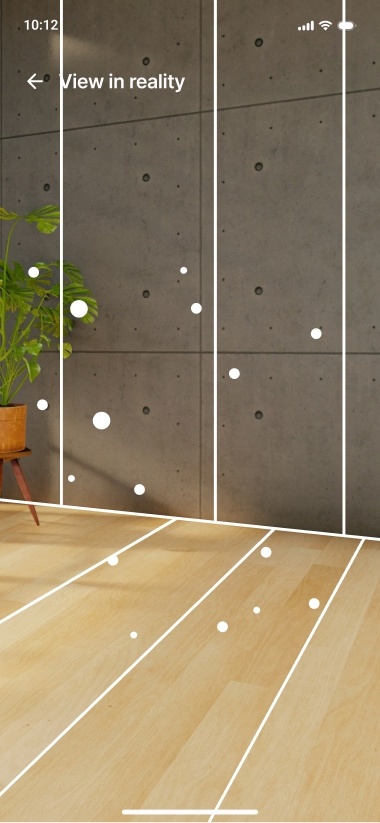
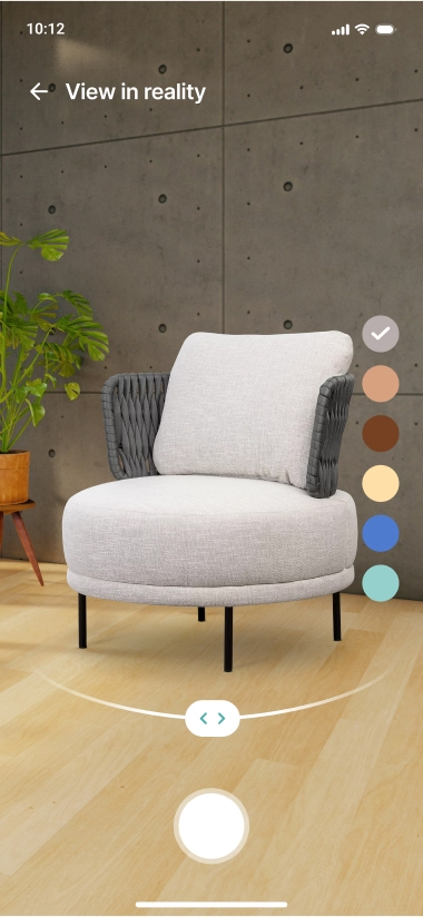
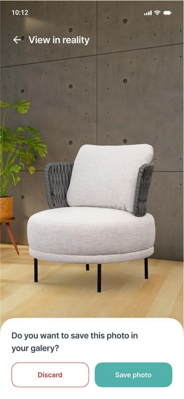
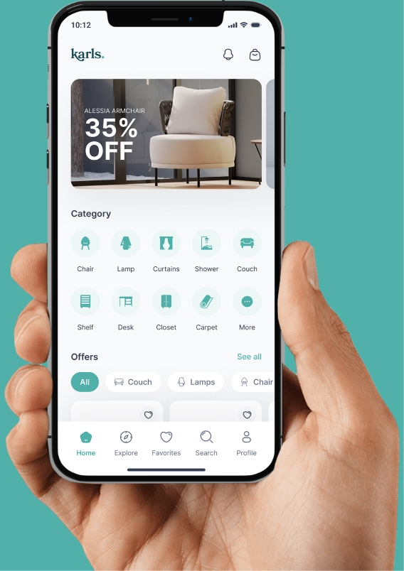
The Karls application was developed with the aim of facilitating the purchase of new furniture with experimentation in augmented reality and intuitive navigation.
02.
Person
A persona in user-centered design is a fictional character created to represent a type of user who might use a website, brand, or product in a similar way.
Pedro Vaz
”Buy furniture for a room in a republic in an e-commerce”
18 years
Boston - MA
Incomplete Higher Education
Single
Parents allowance
About:
Pedro is an 18-year-old university student who will live in a dormitory with other students. He needs to furnish his room and is looking for practical and affordable furniture in an e-commerce.
As a university student, Pedro has a busy routine and prefers to shop online at an e-commerce that offers an easy and fast shopping experience. He values a site with intuitive navigation, quality images and detailed product descriptions. Pedro also expects efficient service and fast, safe delivery.
With a limited monthly income of U$ 500.00, Pedro is looking for furniture that is practical and economical. He prefers multifunctional furniture that can be used for different purposes, such as a bed that has drawers for storing clothes or a table that can be used as both a desk and a dining table.
As a young university student, Pedro is always looking for decoration trends and likes modern and funky furniture. He is open to trying new ideas and styles that can make his room more interesting and cozy.
Pedro is also willing to spend time researching and comparing prices to find the best deals and deals. He looks for e-commerce that offers good value for money and has a good reputation in the market. In addition, he is always looking for recommendations from friends and family to help him choose furniture for his dorm room.
Ana Paula
”I need to buy furniture to furnish my new house, but I don’t have enough time to go at the store”
48 years
San Francisco - California
Complete Higher Education
Married
Developer
About:
Pedro is an 18-year-old university student who will live in a dormitory with other students. He needs to furnish his room and is looking for practical and affordable furniture in an e-commerce.
As a university student, Pedro has a busy routine and prefers to shop online at an e-commerce that offers an easy and fast shopping experience. He values a site with intuitive navigation, quality images and detailed product descriptions. Pedro also expects efficient service and fast, safe delivery.
With a limited monthly income of U$ 500.00, Pedro is looking for furniture that is practical and economical. He prefers multifunctional furniture that can be used for different purposes, such as a bed that has drawers for storing clothes or a table that can be used as both a desk and a dining table.
As a young university student, Pedro is always looking for decoration trends and likes modern and funky furniture. He is open to trying new ideas and styles that can make his room more interesting and cozy.
Pedro is also willing to spend time researching and comparing prices to find the best deals and deals. He looks for e-commerce that offers good value for money and has a good reputation in the market. In addition, he is always looking for recommendations from friends and family to help him choose furniture for his dorm room.
Michael B.
”I need to buy furniture to furnish my first apartment”
26 years
Toronto - Ontario
Complete Higher Education
Married
Professor
About:
Michael is a 26-year-old young man, recently married and a university professor. He and his wife have just moved into their first apartment and now need to furnish it. With a monthly income of CAD 5,000.00, Michael B. is looking for an e-commerce that offers quality furniture at affordable prices.
Michael is attentive to decoration trends and likes to keep up with market news. He prefers modern and functional furniture that meets his daily needs and provides comfort and practicality. In addition, he looks for furniture that is easy to assemble and that can be adapted to different spaces.
As a university student, Michael has a busy routine and prefers to shop online at an e-commerce that offers an easy and fast shopping experience. He values a site with intuitive navigation, quality images and detailed product descriptions. Michale B. also expects efficient service and fast, safe delivery.
Michael is on the lookout for special discounts and deals to save money. He is willing to spend time researching and comparing prices to find the best deals. In addition, he is open to suggestions and recommendations from friends and family to help him choose furniture for his first apartment.
03.
Architecture
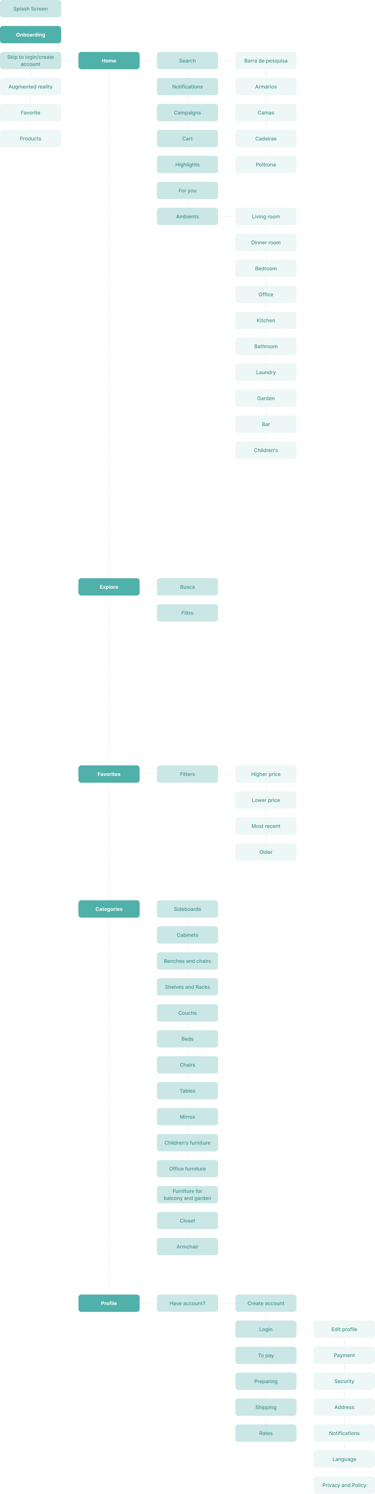
There are many different paths a user can take when interacting with a product. Having an app architecture is ideal for having an overview of all the possibilities of the paths that can be taken when using the app.
04.
Typography
05.
Colors
Colors are a fundamental element of UX/UI design as they play an important role in how users perceive and interact with a digital product. The choice of colors was based on a WCAG 2.1 contrast system.
Base
These are base black and white color styles to quickly swap out if you need to.
AAA 21:1
White
#FFFFFF
AAA 21:1
Black
#000000
Gray
Gray is a neutral color and is the foundation of the color system. Almost everything in UI design, text, form fields, backgrounds, dividers are usually gray.
AAA 10.2:1
25
#F4F5F6
AAA 10.01:1
50
#F9FAFB
AAA 9.49:1
100
#F2F4F7
AAA 8.84:1
200
#EAECF0
AAA 7.09:1
300
#D0D5DD
AA 4.06:1
400
#98A2B3
AAA 4.97:1
500
#667085
AAA 7.68:1
600
#475467
AAA 10.46:1
700
#344054
AAA 14.7:1
800
#1D2939
AAA 17.74:1
900
#101828
Primary
The primary color is your “brand” color, and is used across all interactive elements such as buttons, links, inputs, etc. This color can define the overall feel and can elicit emotion.
AA 5.69:1
25
#EDF7F6
AA 5.21:1
50
#DCEFEE
AA 4.75:1
100
#CAE7E5
AA 4.33:1
200
#B9DFDD
AA 6.03:1
300
#96D0CC
AA 4.94:1
400
#73C0BB
AA 4.02:1
500
#50B0AA
AA 3.9:1
600
#408D88
AA 6.21:1
700
#306A66
AAA 10.39:1
800
#204644
AAA 13.18:1
900
#183533
Alerts
Alert colors play a vital role in user experience by providing clear visual cues:
Red: Signals errors or destructive actions, such as deleting a user, to indicate a negative or critical state.
Yellow: Draws attention to warnings or on-hold actions, helping users recognize potential risks or decisions requiring confirmation.
Green: Represents success or positive outcomes, like completed tasks or confirmations, reinforcing a sense of accomplishment.
A 3.75:1
Error
#F04438
AA 6.33:1
Attention
#FDB022
AA 4.02:1
Success
#CAE7E5
06.
Wireframes
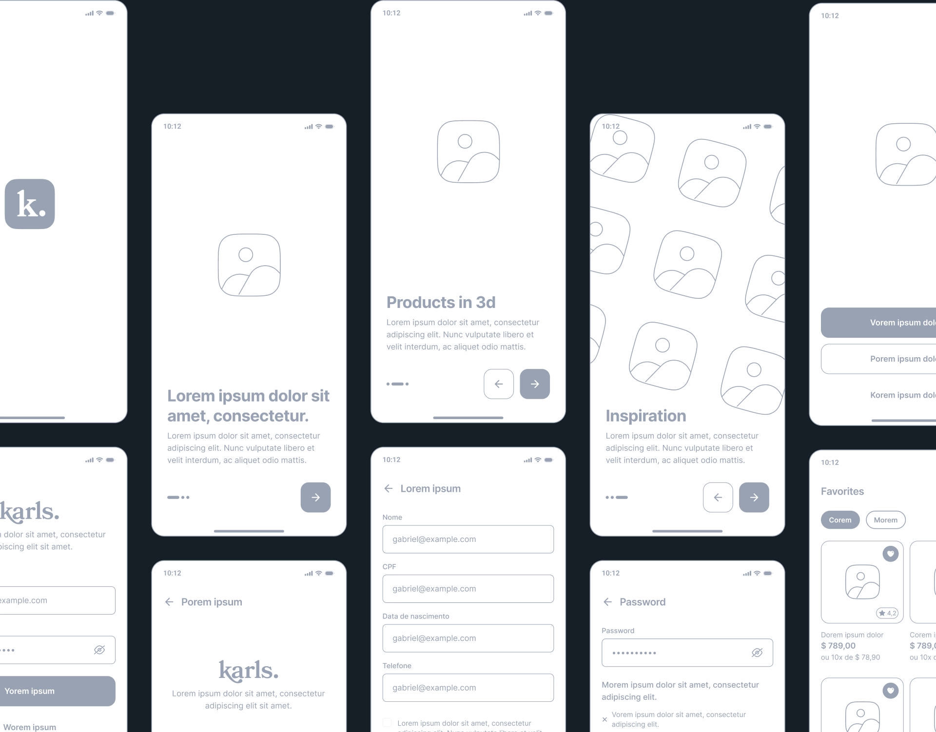
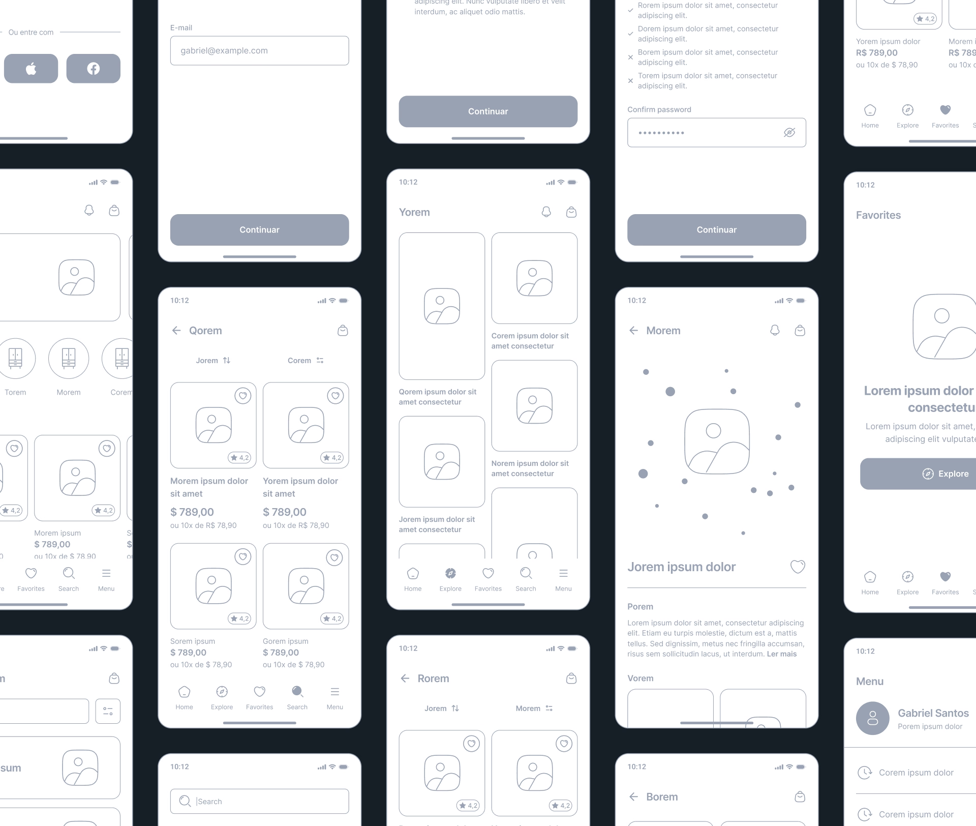
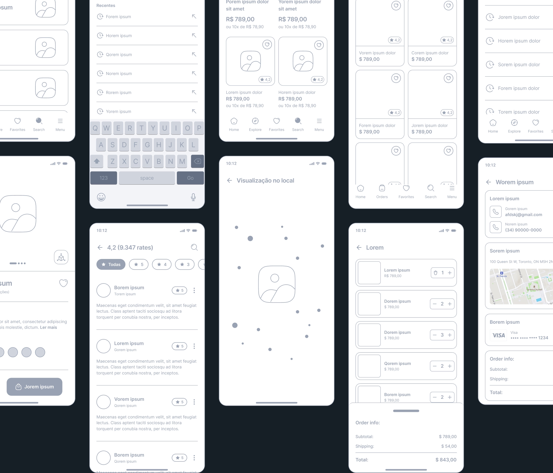
I turned my initial ideas into some low-fidelity wireframes to open up the field of vision. Below you will find highlights of some wireframes for the user flow.
07.
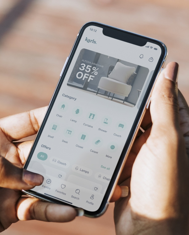
High fidelity
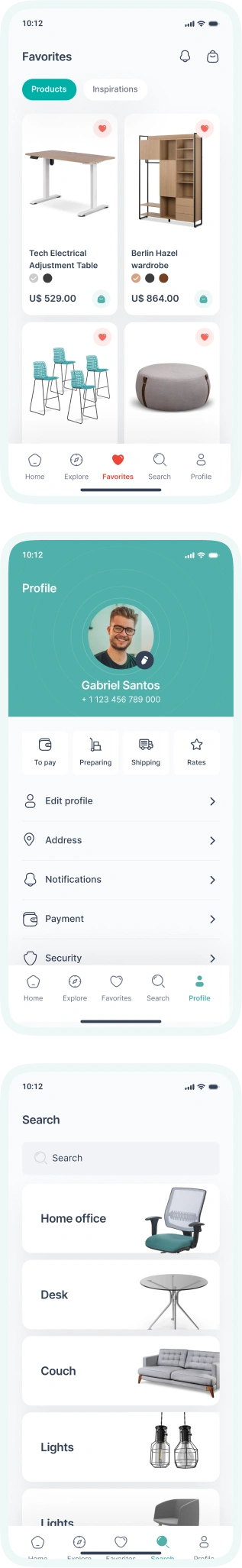
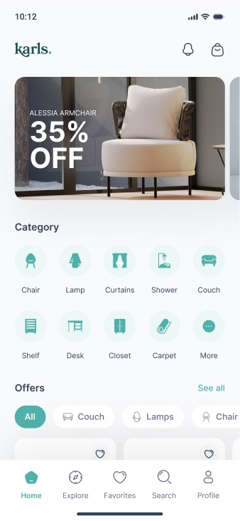
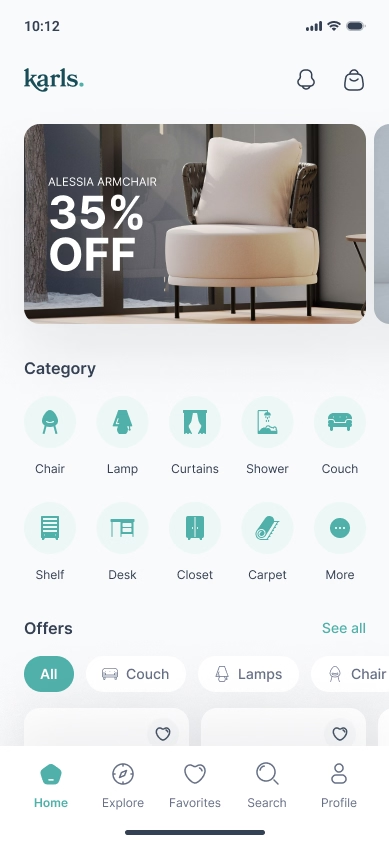
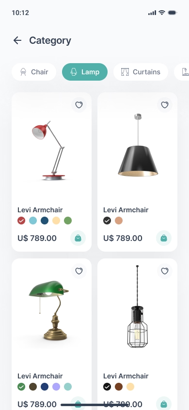
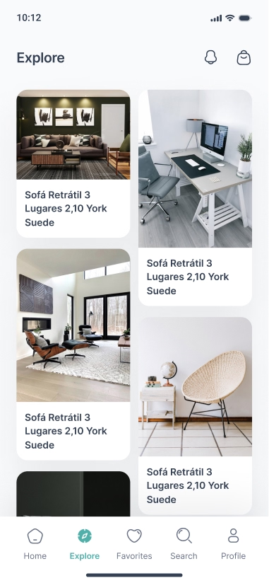
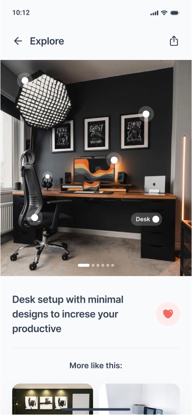
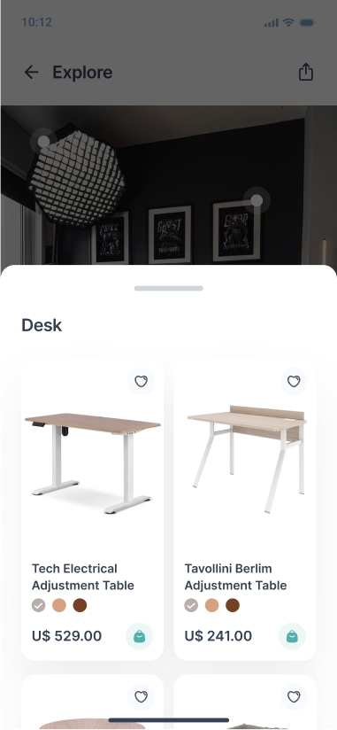
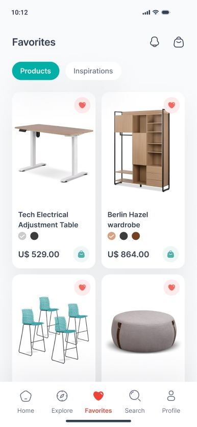
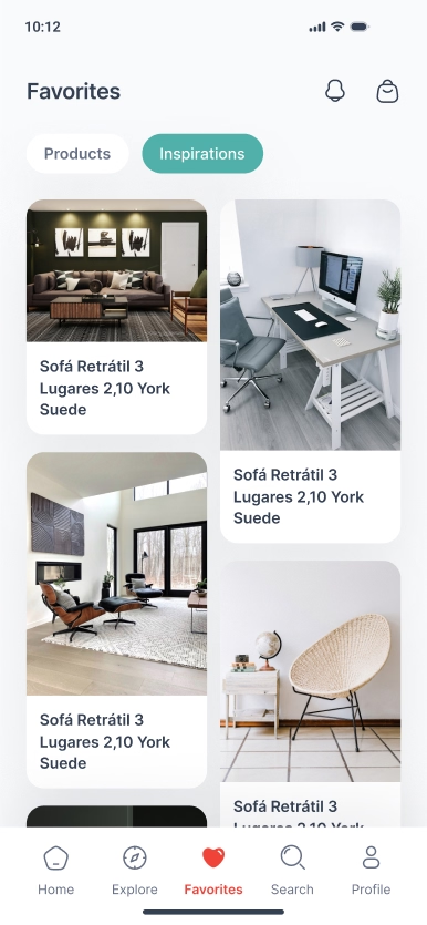
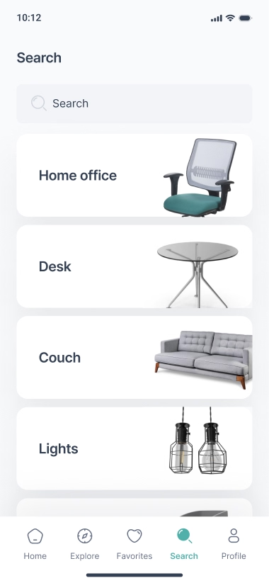
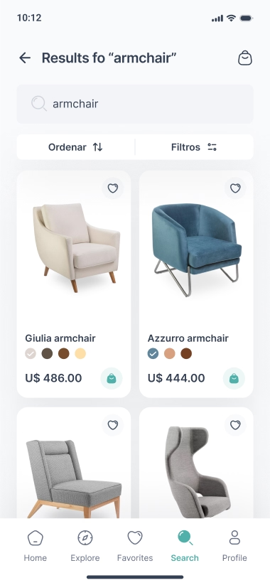
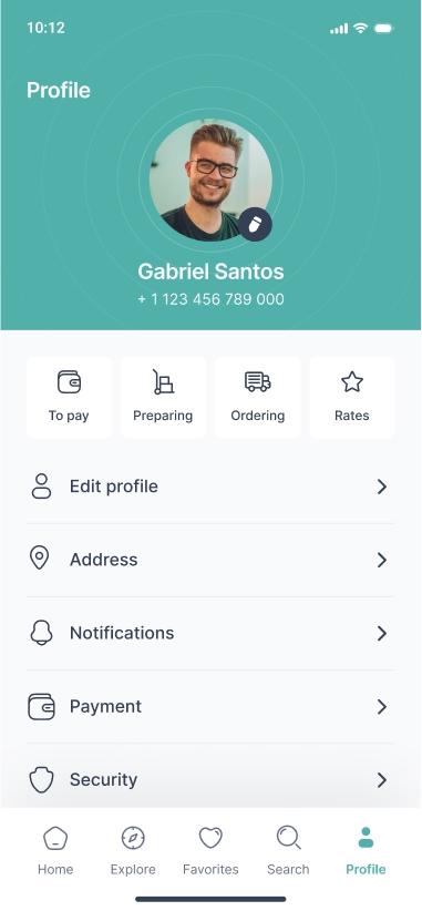
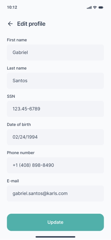
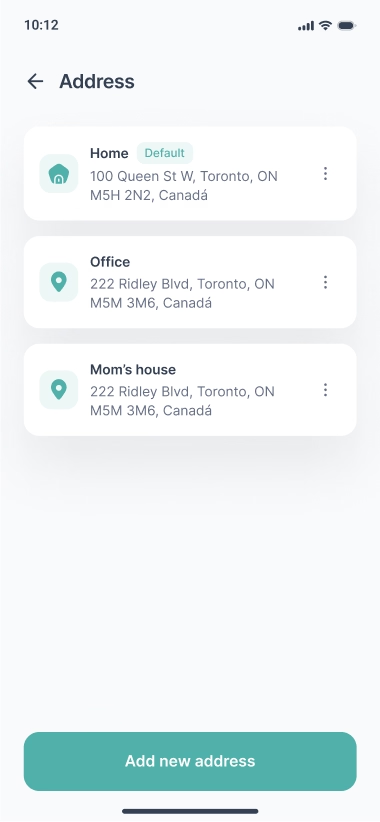
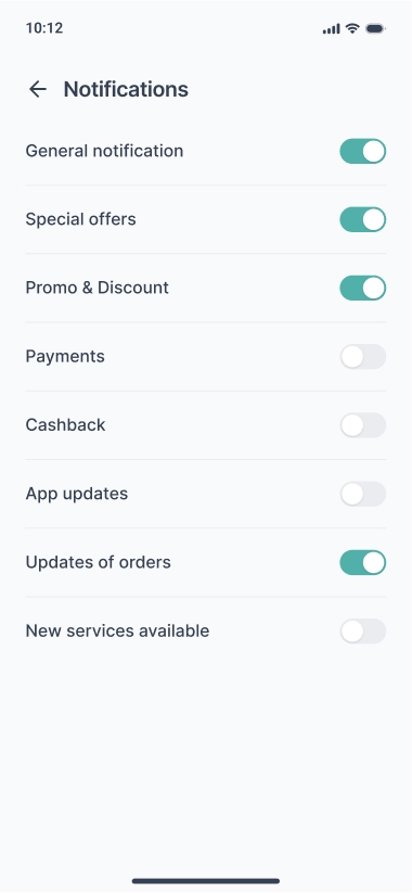
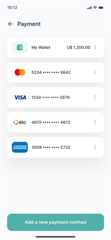
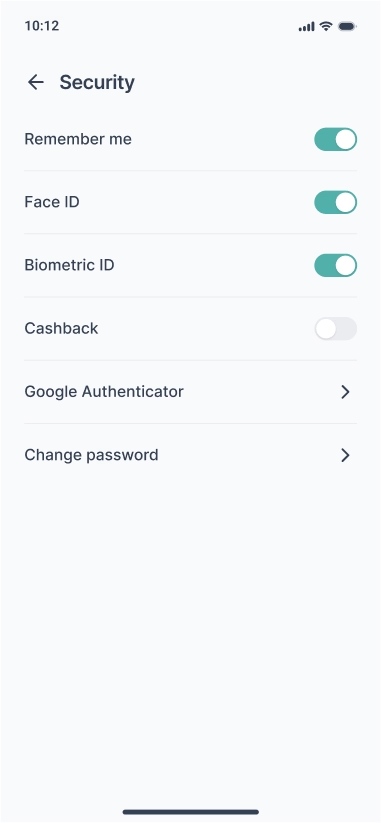
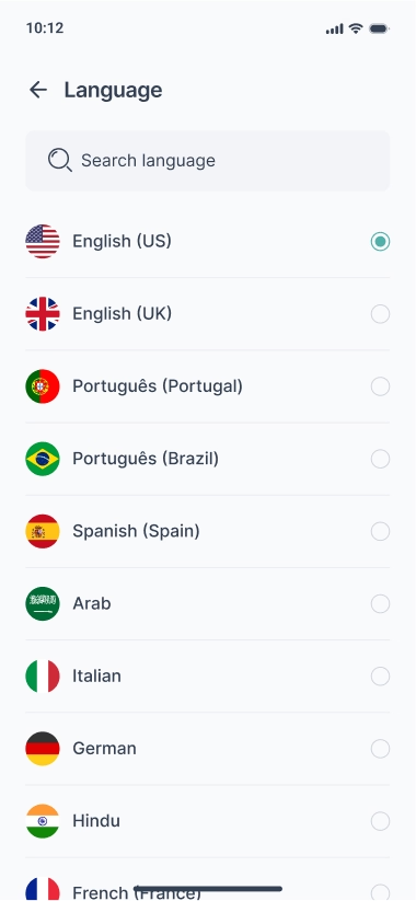
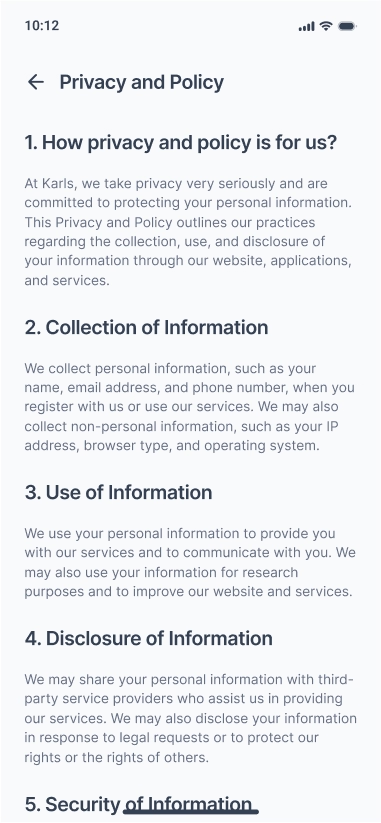
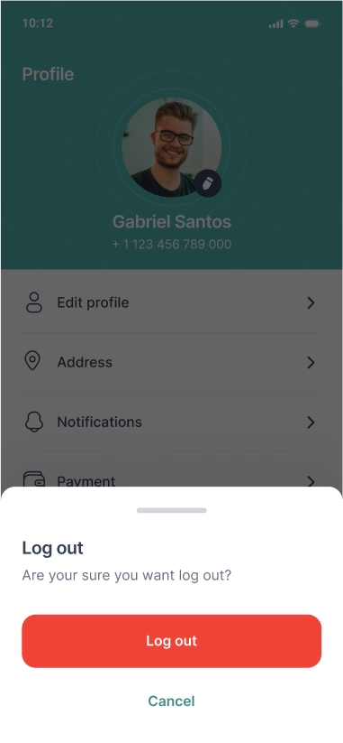
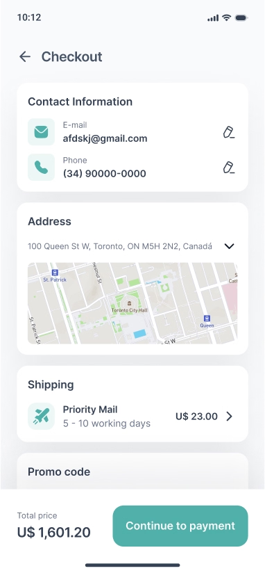
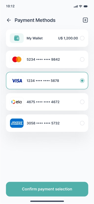
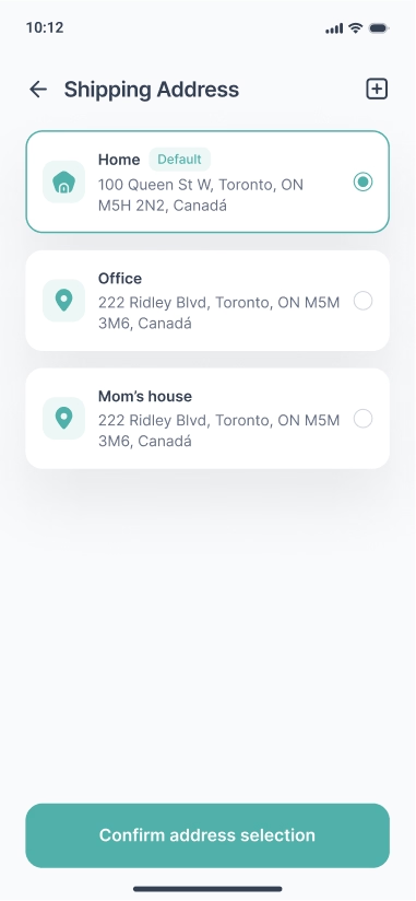
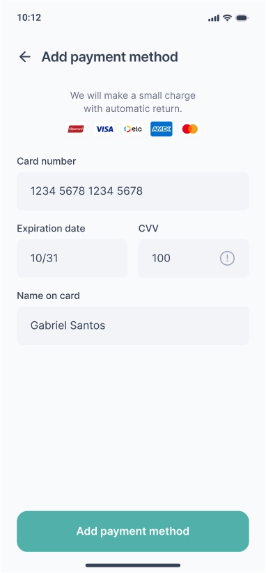
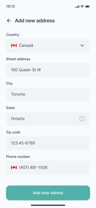
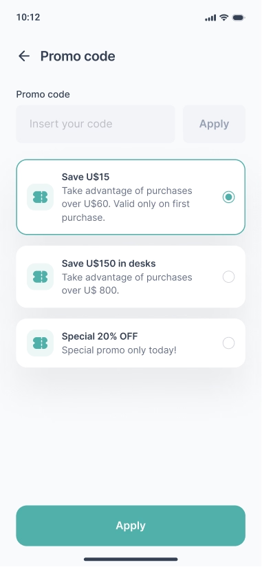
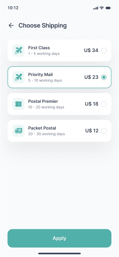
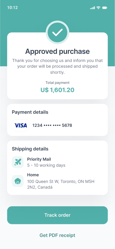
The app is designed in a minimalist, clean and intuitive style. I took into account users of different ages and paid close attention to accessibility.
Below you will find all the screens that were designed for this personal project.