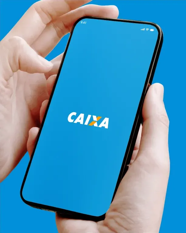
The Caixa app makes your day-to-day life easier! You can access your Caixa account to check your balance, statement, card bill, make payments, transfers, investments, top up your cell phone and much more!
Download the app, register your username and password and remember them! With them, you can access all your Caixa accounts. That’s right, with a single username and password, you can manage all your accounts without having to log out and log back in, it’s that simple!
02.
Person
A persona in user-centered design is a fictional character created to represent a type of user who might use a website, brand, or product in a similar way.
Vera Helena
“I want to be able to see how much money I have in my account and be able to do my gambling.”
62 years
Jundiá - AL
Complete Elementary Education
Married
Retired
Bio:
Vera was born in a city in the interior of the state of Alagoas. She had a simple life working in the fields, on the orange groves, and helped with the harvest at the time. She then worked in several companies as an administrative assistant, had children and grandchildren, and retired at the age of 58. Vera always believed that one day she would win the lottery, so every week she takes a chance, but due to an accident, she has difficulty getting around, and since then she has started to do all her banking transactions on her smartphone on a daily basis.
Needs:
Pay bills without having to leave home;
Play the lottery on your cell phone.
Weakness:
Difficulty moving around to perform operations that can be done via cell phone;
Has little familiarity with technology;
David Silva
“I need to pay my bills stress-free with just a few taps”
26 years
São Paulo - SP
Complete Higher Education
Single
Process Manager
Bio:
David grew up in a city in the interior of the state of São Paulo, but he always had an interest in technology. After reaching adulthood, his free time was very limited due to the rush of everyday life, so David always chooses to do all his tasks on his smartphone whenever possible. He needs agility.
Needs:
Have more time for your tasks;
Convenience in carrying out transactions and banking operations.
Weakness:
Having to copy and paste the barcode for payments;
The app has too many steps for simple processes;
Too many options in the app that lead to the same place.
03.
Architecture
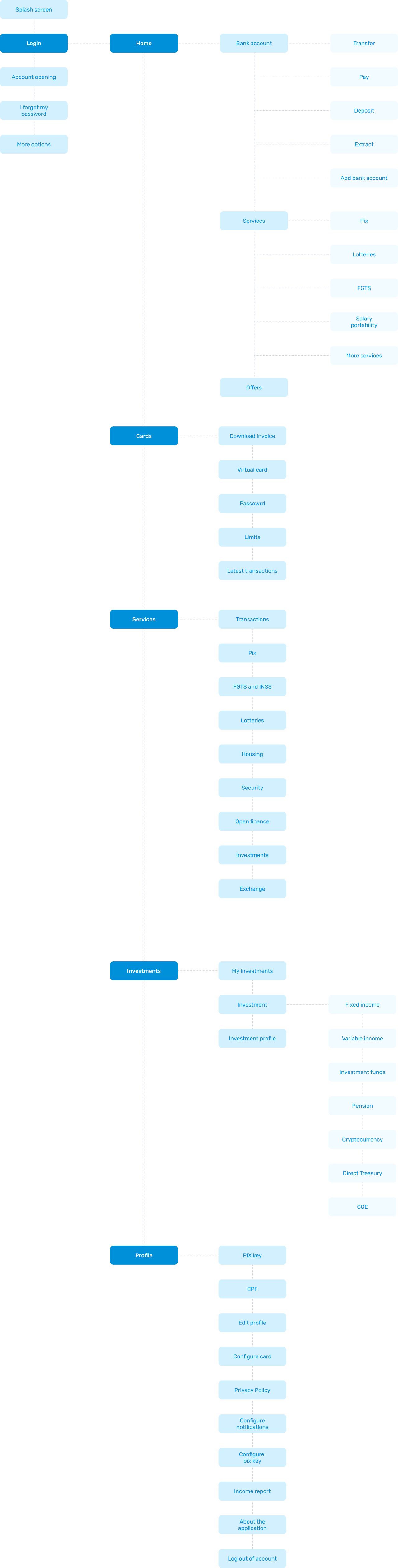
There are many different paths a user can take when interacting with a product. Having an app architecture is ideal for getting an overview of all the possible paths a user can take when using the app.
04.
Typography
06.
Colors
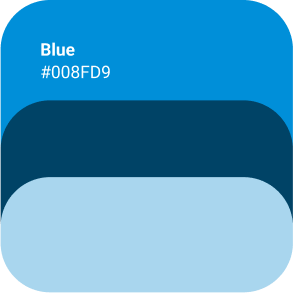
The colors used in the project were based on Caixa Econômica’s existing color palette, but I made some changes to make them more vibrant and vivid.
The main color used was blue, to give the app a lighter feel. Yellow was used for the checking account.
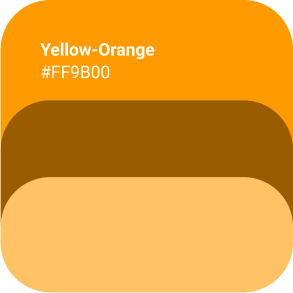
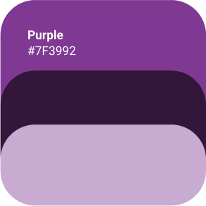
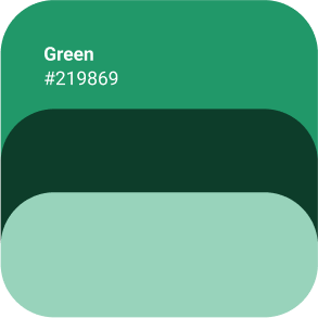
However, the colors green, purple and yellow were used for the lottery products.
06.
Wireframes
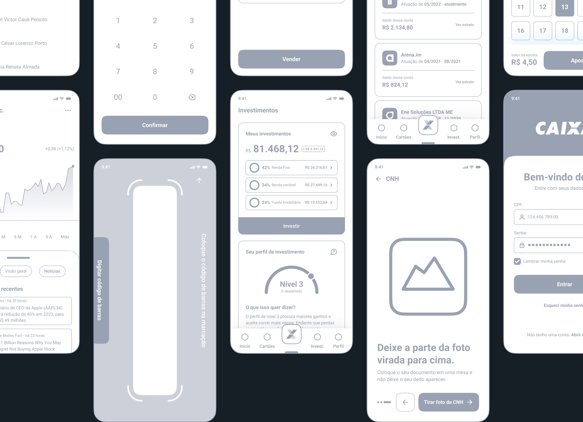
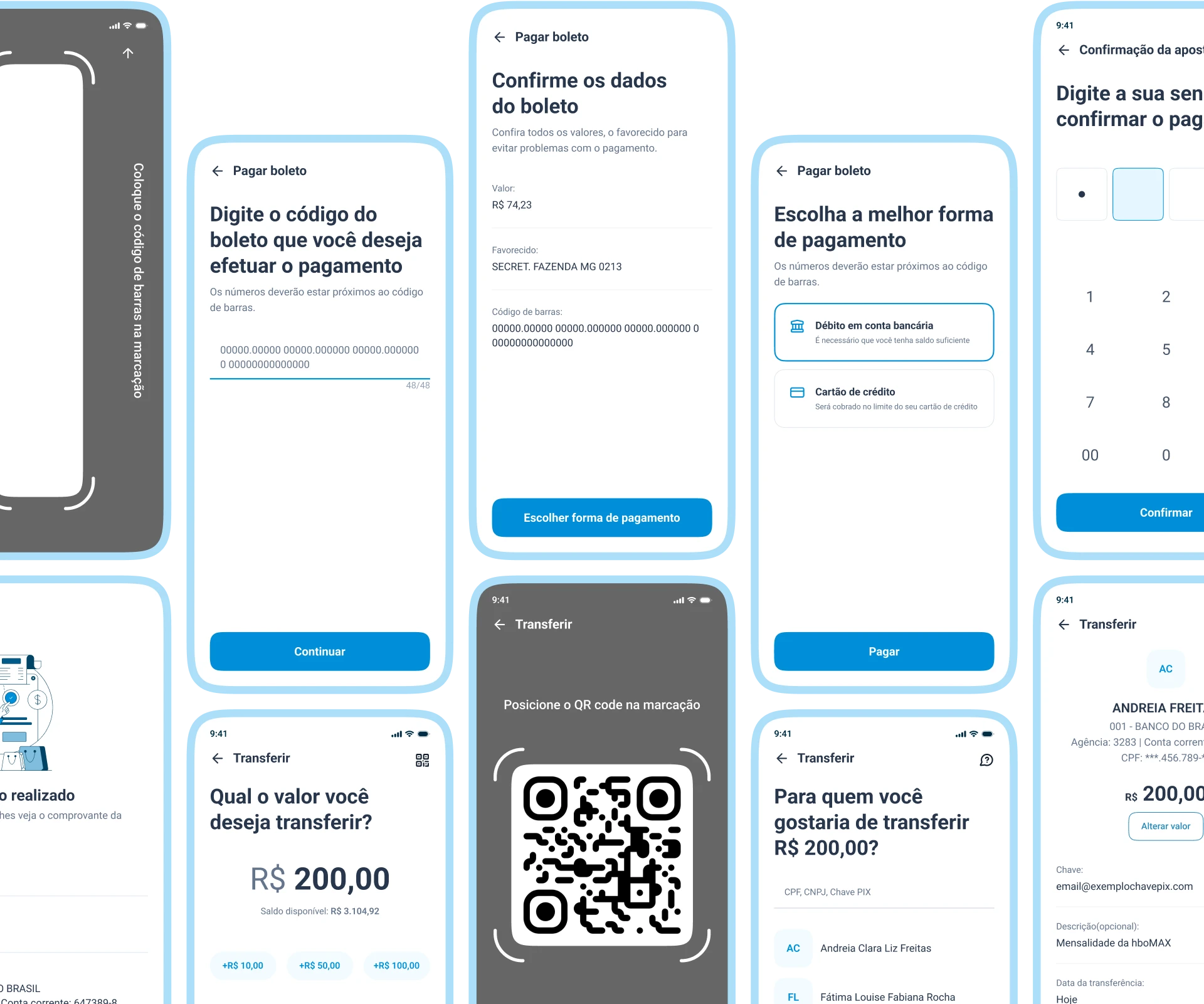
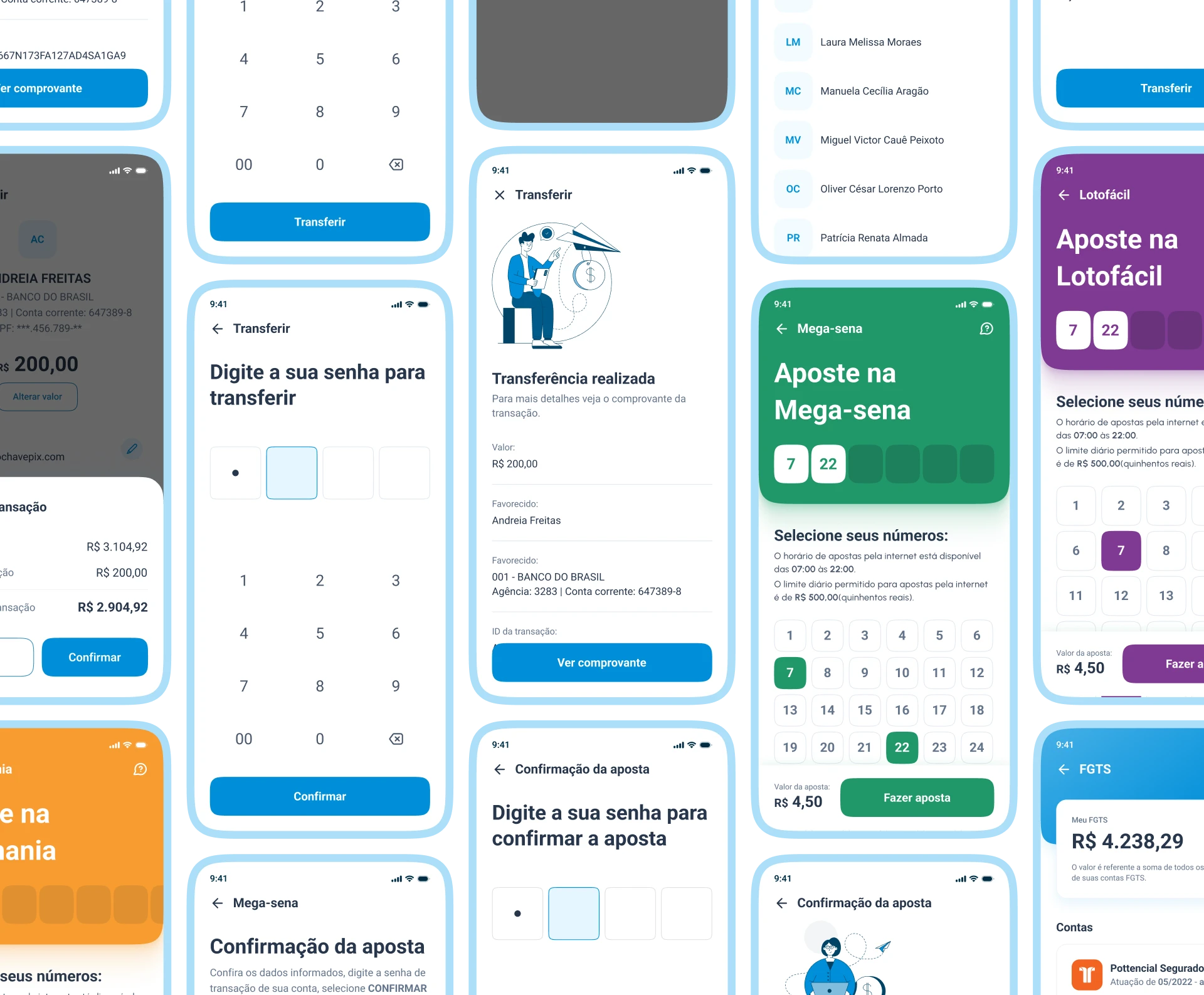
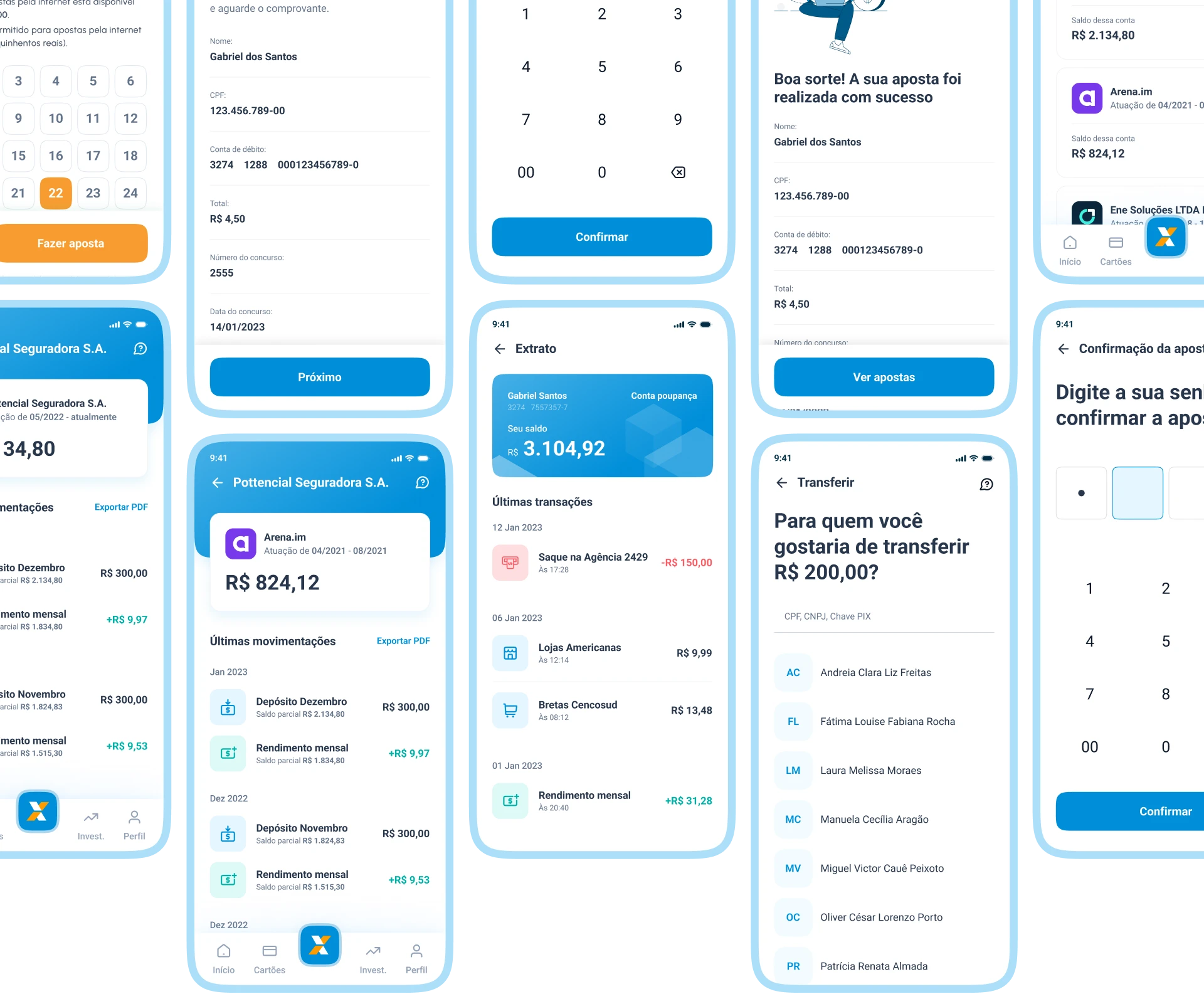
I turned my initial ideas into some low-fidelity wireframes to open up the field of vision. Below you will find highlights of some wireframes for the user flow.
07.
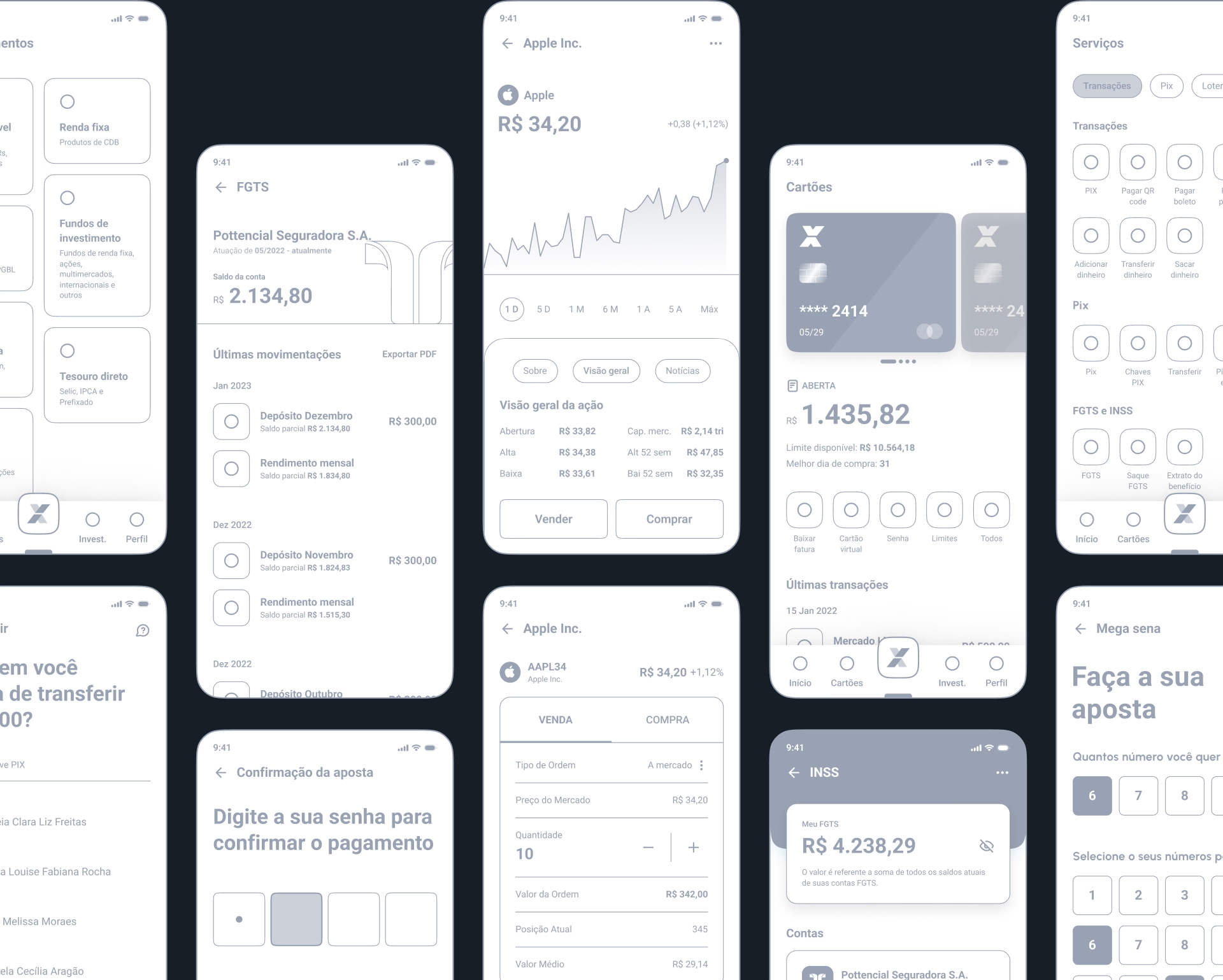
High fidelity
The app is designed in a minimalist, clean and intuitive style. I took into account users of different ages and paid close attention to accessibility.
Below you will find all the screens that were designed for this personal project.
08.
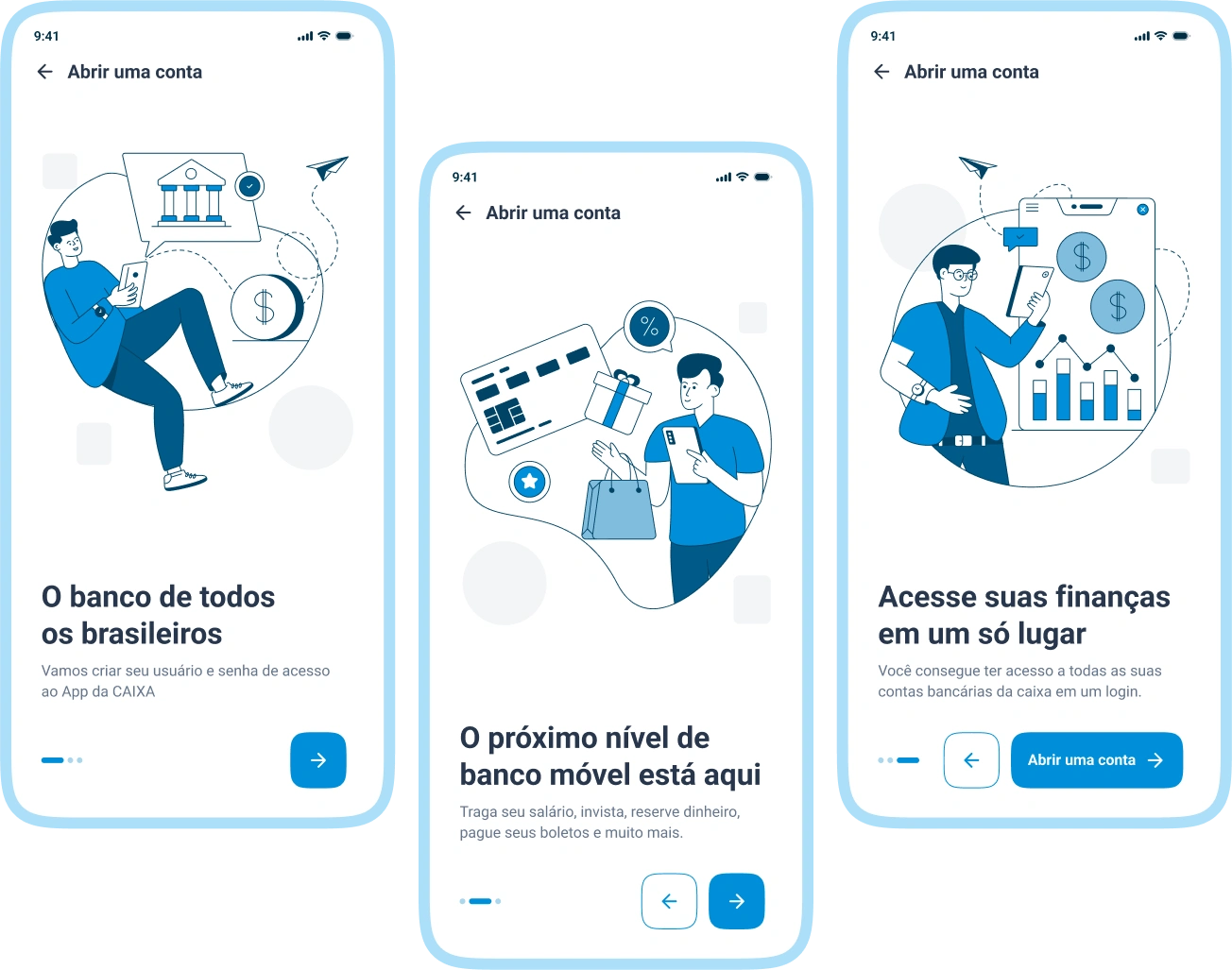
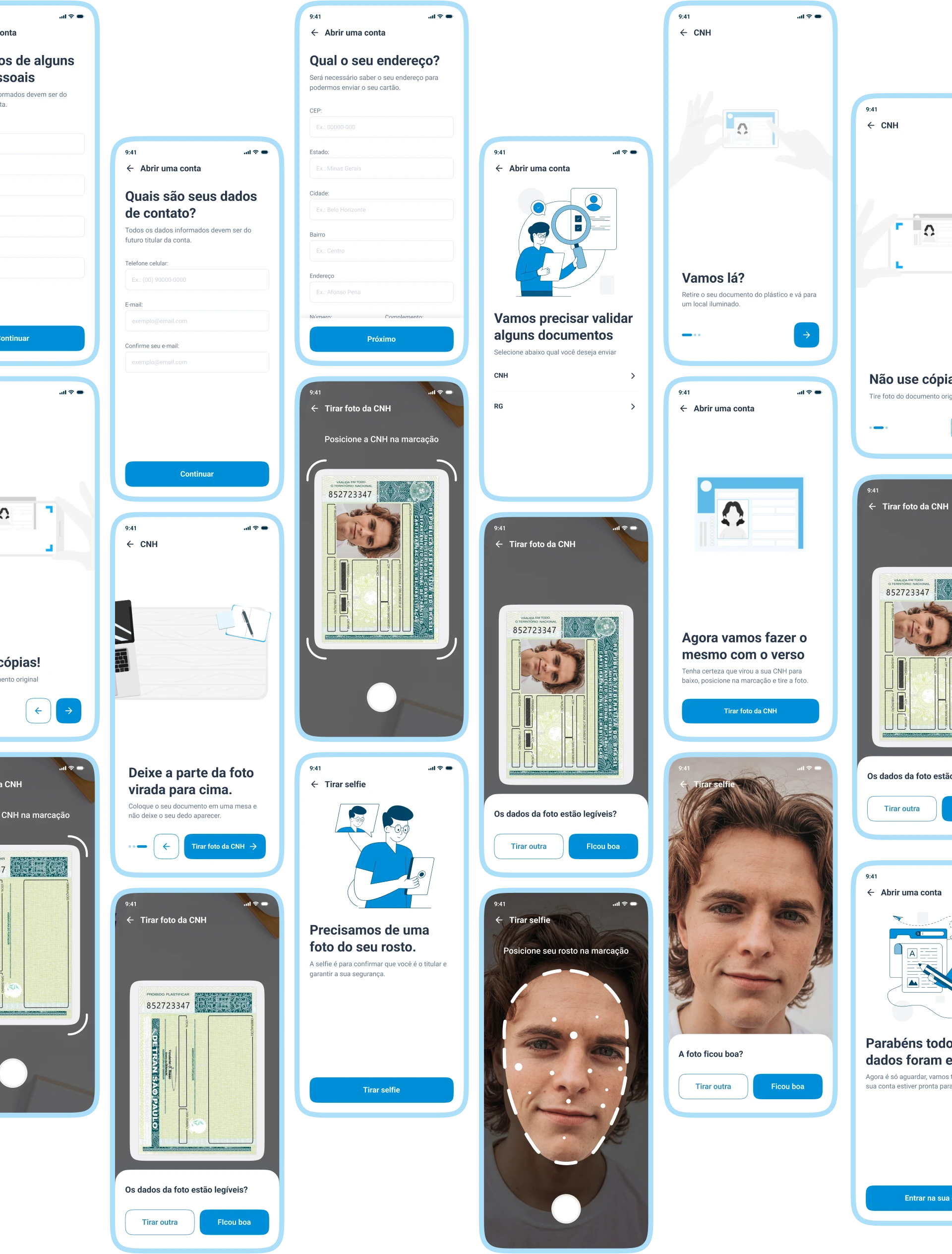
Login and Account Opening
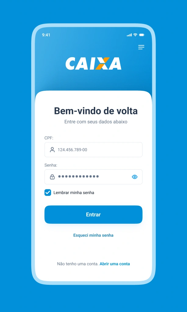
The app currently has too much information on the login screen.
I reworked the login screen to make it more minimalist and straightforward, but the options that still exist have been moved to a menu at the top of the screen.
09.
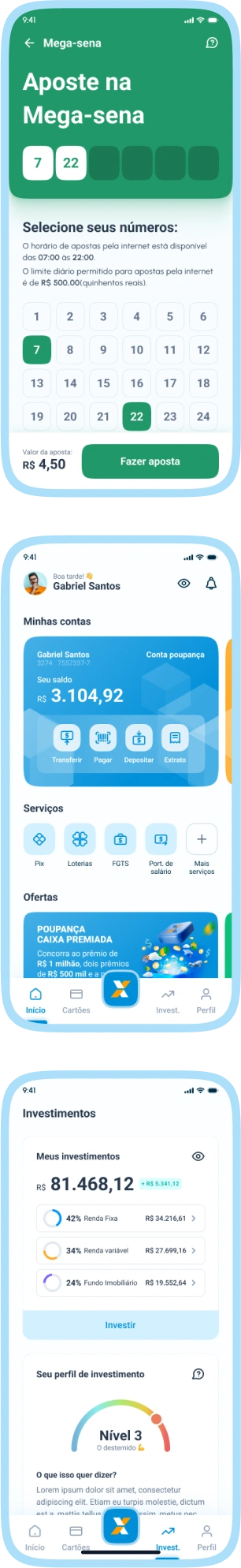
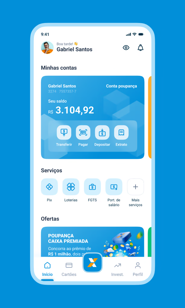
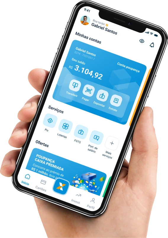
Home
The Caixa app’s home screen currently has all the shortcuts to the services in a way that clutters the screen and makes it difficult to access them because you don’t know where they are.
I brought the bank accounts linked to each user to the main screen, as well as some shortcuts to the transactions that can be performed.
In the second category, I placed the main services that are most accessed, which can be changed according to the user’s preference.
Finally, I brought a category for the offers and new features that the bank wants to announce.
10.
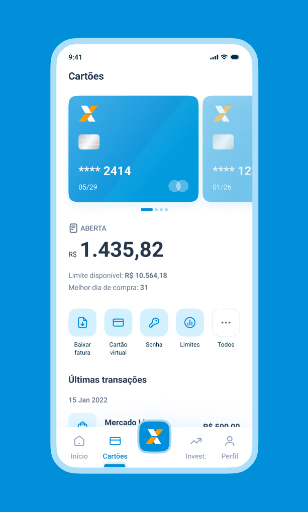
Cards
In this section you can access your credit card, track and download your invoice, display your virtual card, change your password, adjust your card limit, track the latest transactions, among other features.
11.
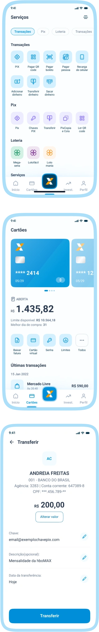
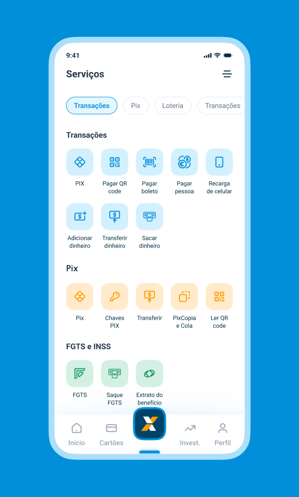
Services
Before, all services were displayed on the first screen, so I worked to ensure that all services were adapted into a central menu with the Caixa logo, separated by categories with the services that could be performed.
12.
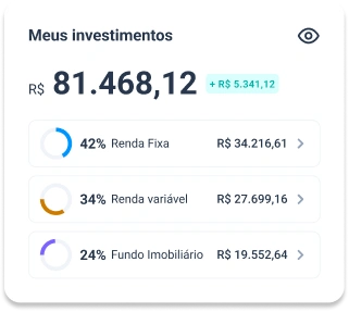
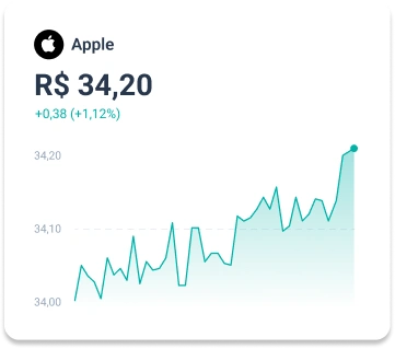
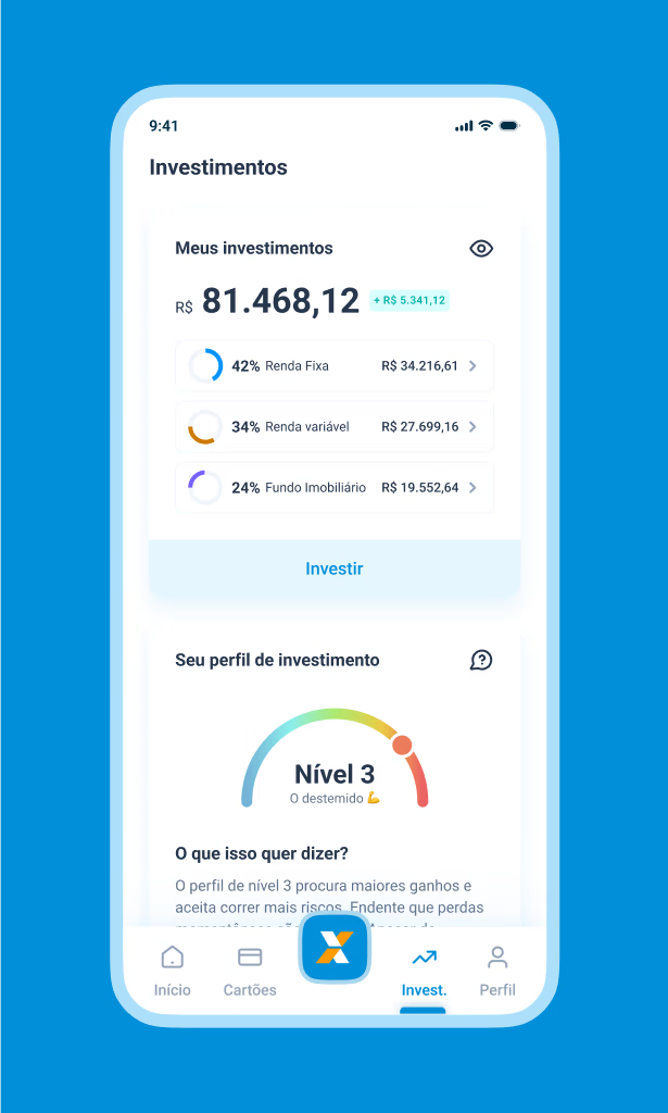
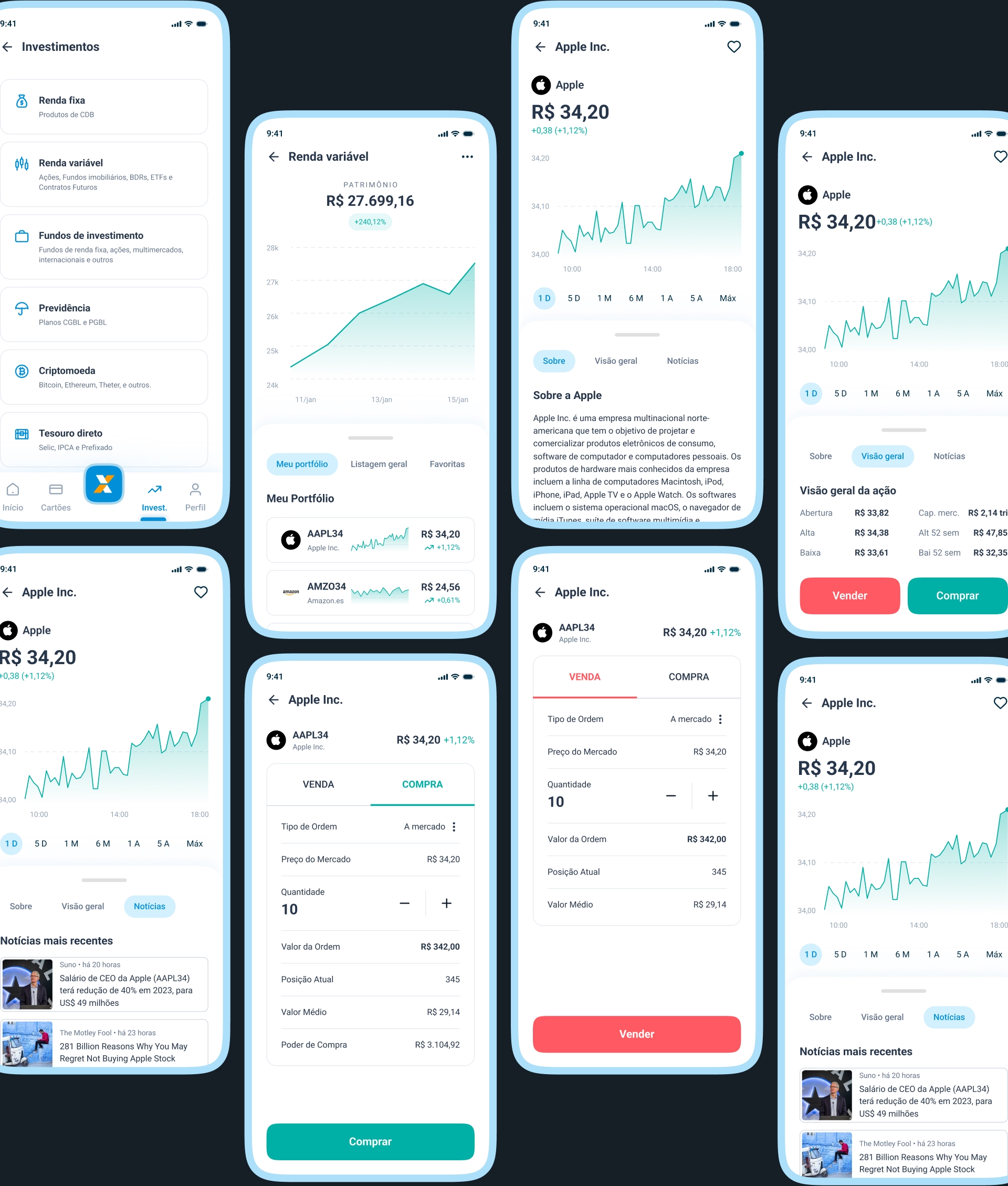
Investments
Currently, Caixa Bank only offers pension investment, but I took the liberty of including some other types of investments.
The user has an overview of all the investments they have and can access their own investor profile.
The user would also have an area where they can trade shares in the variable income market.
13.
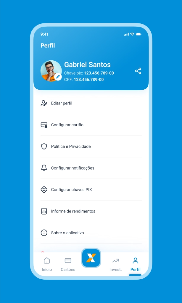
Profile
In the profile tab, the user can see all the information about their user, configure limits, pix keys and many other features.